Summary
Many people have reported problems with the size of fonts when viewing MailChimp emails on mobile devices. The MailChimp mobile preview shows fonts as large and readable. When viewed using the Mail app on an iPhone, the fonts are smaller than expected.
Many of the available support documents are 10 years old and refer to Blackberry devices and other devices or software that no longer exist. The problems described below have existed for over a decade and haven’t been resolved by industry standards.
This document describes what the problem is, and at least in a limited way, a solution that works for MailChimp email campaigns that should help when viewing on most modern mobile devices.
No. It’s Not Just MailChimp.
This problem of font sizes on mobile devices is not isolated to MailChimp. This is a wide-spread issue impacting email font sizes on many mobile devices and applications.
There are several causes that individually or collectively impact font sizes on mobile devices. You will probably notice that emails from other senders also have small fonts on mobile devices.
- DEVICE FONT SETTING — Smartphones have built-in font size settings that may override font size settings in emails and on web pages. This override ability is necessary so people with sight impairment are ensured that content is readable regardless of the original size settings.
- DEVICE VARIATIONS — Web developers know that there are thousands of devices possibly used for viewing content. This is why content testing services like BrowserStack will compare your content across more than 3,000 devices for review. [Learn More] Obviously it’s not possible to have content appear the same (or acceptable) on every device since they are all different. So, what developers do is to design for some of the most popular devices.
- EMAIL CLIENT — Smartphone email apps like Apple Mail, Gmail, and Outlook are able to disregard email font size settings. This allows the user to define what fonts they want to use when viewing and composing emails.
- SCREEN SIZE AND RESOLUTION — Apple iPhones have a high resolution “Retina display” that is sometimes interpreted by websites and email clients as being a different resolution than it actually is. As a result, a 16 to 18 point font on an iPhone may look like an 8 to 9 point font. This can also happen on other smartphones. So, it’s necessary to use a larger “body” font for your mobile style.
- STYLE AND HTML PRIORITY — There are several methods of defining the size of fonts in a MailChimp campaign. This is explained more in the solution explained below. In summary, correctly following the MailChimp instructions for defining mobile font sizes (using the Mobile Style feature) won’t work if a font size is independently defined using HTML within a text box. The HTML font size request will override the mobile directive. This same issue impacts other email sending services and programs.
A Solution That Mostly Works
There are many suggestions online regarding how to fix device email font size problems on mobile devices. People who have tried those suggestions mostly report that those suggestions don’t work.
As explained in the MailChimp support guide “Campaign Behavior on Mobile” no solution is guaranteed because there are many different devices and standards. Even in ideal conditions, many problems can arise.
The following solution generally works with MailChimp campaigns. These instructions assume you are using the classic MailChimp editor.
STEP #1 — Set Mobile Style
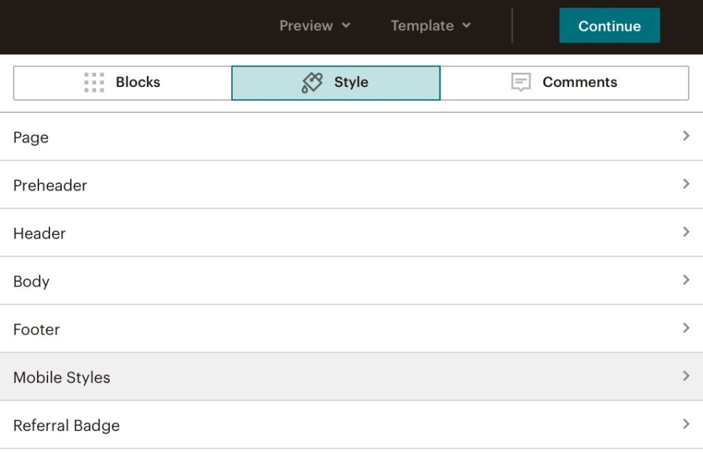
Without selecting any specific block or module in your newsletter, from the top of the screen, choose the Style tab and select Mobile styles as shown below.

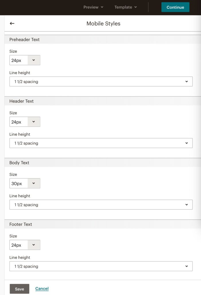
When you select the Mobile Style menu option, the following screen will be displayed. In the example below, after scrolling down, the Header Text and Body Text font size settings are displayed.
The default font sizes might be 16px or 18px. for the Body Text. Change this to 30px and try increasing the size of the other font styles. Then press Save.

STEP #2 — Set Block Text Style
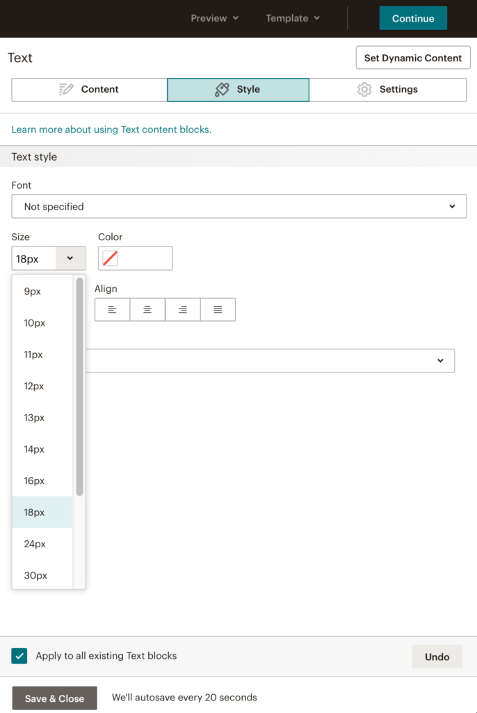
For each text box used in your newsletter, select the edit option for that block, then click on the Style tab and set the font to 18px which is a good size for desktop computers. This is shown below.

You can check the box “Apply to all existing Text blocks” to save some time.
The mobile style selected in Step #1 will have priority over this setting when viewed on a mobile device. However, the Block Text style you set here in Step #2 will be the one used on desktop or laptop computers.
STEP #3 — Remove HTML Codes
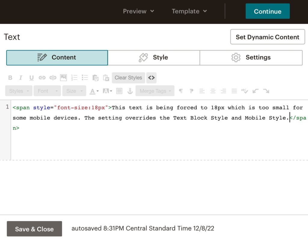
Your text blocks likely have HTML font style codes that will override the settings in Step #1 and Step #2 so those HTML codes need to be removed. To view the HTML codes click on the <> icon seen on the far right of the top toolbar row.

You may see some HTML codes like what you see above. These codes get entered when you select font adjustments from the toolbar in the text block edit mode. For example, if you select some text and click on the Size drop-down menu, then choose 18px, the HTML code for 18px font size will be applied to the HTML of your text.
By deleting the code beginning with <span … and ending with 18px> it will remove the problematic HTML code that overrides font style settings in the Mobile Style menu from Step #1.
Alternatively, you can use the Visual editor (click on <> to leave HTML view) and select your text, then click on the Clear Styles button in the top row toolbar. This will remove all extraneous HTML codes.
Note that some HTML codes will not override the Mobile Style setting such as center, bold, italic, and other minor font adjustments. So, those layout and formatting options are okay to use.
You will notice in the MailChimp composer / editor (the edit view on the right) your Text Bock fonts will seem very small.
However, the font displayed in the preview (on the left) should reflect the Text Box style you’ve selected in Step #2.
Later, when you send out a Text Message, the fonts should be displayed properly as was set in Step #1 and Step #2 depending on the device being used.
Other Formatting Issues
After repeatedly reviewing every detail of your HTML code, you may still notice some abnormalities with the appearance of your MailChimp newsletter. This could be the result of corrupted blocks or some HTML code hidden from view. It’s not clear what might be causing this, but a solution could be to replace Image Blocks with the Image and Text Blocks. Also, re-creating blocks immediately above where odd text behavior happens.
MailChimp Test Message Limit
As was explained above, the MailChimp mobile preview feature is limited and sometimes inaccurate.So, to be sure a message will show up properly, it is necessary to send test messages while diagnosing formatting issues.
Unfortunately, MailChimp has a hard limit on sending test emails. Here’s what happens:
- You’ll create an email newsletter making changes in design and layout.
- The on-screen live edit preview and even the preview windows for desktop and mobile may not provide you with an accurate presentation of how your modified content will ultimately appear.
- You will send out a test message and immediately see problems that still exist despite not being visible in MailChimp.
- You will make further modifications and send out another test message, repeating this cycle.
A MailChimp support document explains the limitation in these words: “Free plan users can send up to 12 test emails per campaign, but no more than 24 total test emails in a 24-hour period. Tests can include up to six addresses at once. Paid users can send up to 70 test emails per campaign, but no more than 200 total test emails in a 24-hour period. Tests can include up to 20 addresses at once. For example, if you’re on the Free plan, you could test two campaigns 12 times each in a 24-hour period, with one email address per test. Or, you could send three tests of a single campaign to four colleagues over a 24-hour period.” [Source]
So, basically they know their preview feature isn’t entirely accurate and that test messages must be sent out. An allotment of 200 test messages in a 24-hour period is allowed for paid users — a tacit admission that it may be necessary to sent out as many as 200 test messages in a 24-hour period. The block placed on free accounts with a limit of 12 will make it almost necessary to get a paid account unless your email message is very simple, or can be tested over several days.
Conclusion
The reason that other instructions found online don’t work is because they don’t take into account the way in which MailChimp handles styles. There are also the issues mentioned above under the heading “No. It’s Not Just MailChimp.” Remember that keeping your email simple will save you time, and provide a minimalist email for recipients. You won’t need to design different templates for different sizes of screens.
How The Above Solution Was Developed
Here are the steps used to develop the solution.
- When the problem of small fonts was identified, solutions were attempted but none worked. The problem initially wasn’t even noticed because that’s the way most emails appear regardless of the sender. It was presumed to be “Normal” but further investigation was made anyway.
- There seemed to be some overriding HTML code causing the Mobile Style setting not to work.
- A test email from a separate personal MailChimp account was created. For that simple test email, the mobile version displayed a larger font as selected in the Mobile Styles option screen. So, this proved that the Mobile Styles feature in MailChimp can properly send emails.
- It was determined that Text Blocks used in previous campaigns had carried forward some hidden HTML codes that interfered with the Mobile Style settings. This can happen if an older campaign is replicated, bringing in some old HTML codes in old text boxes.
- Copying the text box content into a plain text editor made it possible to get the clean text from the block without any formatting. Pasting this in using the HTML mode ensured no styles were being applied. This seemed to “fix” the problem.
- Alternatively, a test was performed where the text was selected and the Clear Styles option was used for the Text Block.
- When the proper Mobile Style text size setting was used, along with the proper Text Block Style text size setting, with no HTML font adjustments in the text, the email formatting was properly rendered and viewable on desktop and mobile. Thus, the simple 1-2-3 step instructions above were developed.
Problems With Existing Workarounds
Below are a few examples of suggested solutions that address this general issue. Here are the problems with the existing workarounds.
- Global solutions are needed like those described in the document above. The existing suggestions don’t provide consistent results and don’t address the issues described in the document above.
- Any solution designed to address problems on specific devices or mail programs can cause problems on other devices, or not address problems on other platforms.
- You may notice that most of the suggestions below are 7 to 9 years old. The problems they strive to address have still not been resolved by any industry standards.
Sampling of Failing Workarounds
These are examples of the best support documents available. They are old, and most conclude that suggested workarounds aren’t working. They only address specific devices and the solutions that didn’t work a decade ago are now outdated.
- “Gmail App (Android): How to stop text from auto-resizing?” — Litmus, Jenny Salita, 9 years ago. Excerpt: “The Gmail iOS app increases font sizes to make them more legible on mobile. It can however have very unpredictable results and break email templates or make them look worse.” [More]
- “Increasing font size for html email on mobile” — StackOverflow, 7 years ago. Excerpt: “…on mobile (iOs Mail) this rule is completely ignored and font size is tiny so probably the default desktop font is applied” [More]
- “My email looks different in Outlook” — MailChimp support document, date unknown. The document references Outlook 2007, 2010, and 2013 so presumably the guide is about 10 years old. Excerpt: “Mailchimp templates are designed to look great across all email clients. However, versions of Outlook from Outlook 2007 to present use Microsoft Word to render HTML email, which can cause problems with campaign display. Microsoft Word is meant for print design and attempts to render HTML like it would look in print preview, causing the display to look different from what you may have designed and tested.” [More]
- “Override Gmail’s Mobile Optimized Emails” — CSS Tricks, Geoff Graham, 6 Apr 2015, updated 7 Jan 2017. Excerpt: “Many emails are designed with a large screen in mind. Text that looks great on a large screen can be difficult to read on a mobile device, though.” [More]
